.webp%3Fv%3D1785328665507&w=1920&q=75)
Introduction
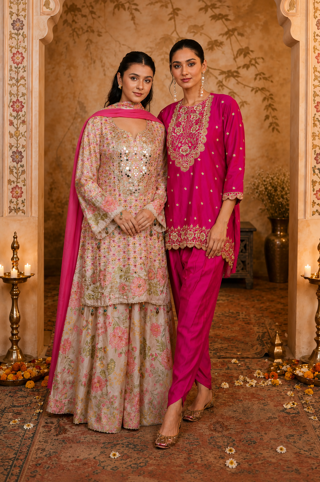
Some mornings call for a shade that shouts, and some call for a shade that whispers. That is basically the entire bold versus pastel debate in one sentence; yes, really. Suits and co-ord sets can go in either direction, and both routes are equally fun to explore. Bold colours bring drama, energy, and a little bit of main character energy to any outfit, like you just decided to show up. Pastels bring calm, softness and an effortlessly graceful vibe that never actually tries too hard. Some days you're bright red. Some days you're lavender. Gulbhahar gets it either way. There is no rulebook that says you must pick one side forever, and honestly most people don’t. Most wardrobes are happier with a little bit of both. Let us get into what each colour mood brings to the table, because it is not just about looks.
Bold Colours Are the Loud Friend at the Party
Think magenta, cobalt blue, and deep red. These are the colours that walk in and immediately get noticed, no questions asked. A bold Party Suit with a clean, simple cut lets the colour do all the talking while you quietly stand there looking intentional. A Floral Print Co-ord Set can turn a basic day into an outfit people remember; like, later they will ask where it’s from. Bold shades photograph beautifully, which is basically a bonus superpower you did not know you needed. Choosing bold colours often means you are simply not in the mood to blend in today.
Pastels Are the Calm Friend Who Somehow Steals the Show Anyway
Blush pink, mint green and lavender never really raise their voices, yet people still hand out compliments. These shades seem to pair up so well with delicate embroidery and softer detailing on Silk Suits, like everything just sits more nicely. Powder Blue Party Wear Coord Set feel light, fresh, and kind of breezy too. They are easy to wear without doing that whole overthinking thing. Also, they play along with almost every accessory you already have in your closet. When you pick pastels, it usually says you want elegance, but you do not need to announce it.
How to Wear Bold Without Looking Like a Traffic Signal
Bold colours are fun, but yes, they need a little styling sense; otherwise it turns into chaos fast. A few simple tricks help bold suits and co-ords look sharp, not shouty. If you follow these, bold colours start to feel confident instead of overwhelming. And honestly, a touch of restraint goes a long way when the colour is doing most of the work.
Let one bold piece take the spotlight, then keep the rest of the outfit neutral.
Skip heavy jewellery, so it does not compete with the colour.
Go for one solid bold shade like Blue Designer Kaftan Suit , not some busy multi-coloured print.
Pick clean, structured silhouettes so the colour has room to breathe.
Treat a bold co-ord like the main character, not a background extra.
How to Make Pastels Less Sleepy
Pastels can feel a bit too quiet if you are not careful, really. If you add texture through embroidery or little fabric details, it wakes up a pastel suit right away. Layering Pastel Pink Sharara Suit with something more structured gives it shape and a little more personality too. If you go slightly deeper into the pastel family, it brings in an extra dimension, but you keep the softness. Matching pastels with a contrasting accessory or two keeps the whole thing from going bland. A pastel outfit should be soft on purpose, not soft by accident.
Why Choose When You Can Have Both
Nobody told you you have to lock into Team Bold or Team Pastel for life. A closet with a balanced mix of both kinds lets you choose on the spot for whatever your mood is doing. A Rust Orange Suit Women's is there when you feel like showing up like a main character, and pastel pieces are there when you want to glide through the day a little more softly, without the extra noise. If you pick Punjabi Suit For Women and co-ord sets in both of those colour groups, switching between “today’s vibe” and “tomorrow’s vibe” feels almost automatic. Honestly, keep both “sides” on speed dial.Having a variety of colours in your wardrobe also makes styling for different occasions much easier. Mixing bold and pastel shades keeps your outfits feeling fresh without constantly shopping for new pieces. A balanced collection gives you the freedom to dress with confidence, no matter the season or the occasion.
Picking Your Colour Mood for the Day
Some days you want to feel like a spotlight. Other days you want to feel like a soft breeze. Bold colours fit the spotlight sort of day, when you want your outfit to speak up. Pastels fit the breezy kind of day, when calm and comfort feel more like you. Suits and co-ord sets work brilliantly in both moods, so nothing is really off-limits. Honestly, your closet should have room for both vibes anyway.
Conclusion
Bold colours and pastels aren’t enemies. They’re basically two very different moods sharing the same closet space. One mood brings brightness, the other brings calm, and both still look great when they’re styled in a strong suit or a co-ord set. The real trick is figuring out which mood you’re in before you pull anything on. The Collection at Gulbhahar has a shade for the mood you're in. Some days ask for that dark red charge; other days lean toward lavender softness. Either way, your outfit has your back.
Tags
